The Guide To Using Componentized Pages
Hero
A hero goes at the top of a page, and has a variety of different templates and options available. Use the Bold button to highlight text.
Pre-Heading Text: The text that appears above the heading.
Pre-Heading Font: Choose mbgmonoline for logos such as mbgclasses, etc.
Pre-Heading Logo: Use an image instead of text for the pre-heading. Primarily used for sponsored/partner pages.
Heading: The heading text of the hero.
Heading Font: Choose mbgmonoline for logos such as mbgclasses, etc.
Subheading: Body text that appear below the heading
Target Navigation Anchor: If Centered Secondary is chosen as the Layout and a Target Navigation Anchor is set, then a down arrow will appear in the hero that links down to a section below.
Layout: Choose the layout for the hero. Layout options are demonstrated below.
Background Color: If you are going to use a background image, choose either "Black" or "White" depending on whether the image is light or dark. For example, if you have a dark background image, set the background color to black so that the text will be white.
Background Media: Choose or upload a background image in the Cloudinary popup.
Include Color Overlay: If the text is hard to read over the background image, select this option to add a color overlay on top of the background image, behind the text.
Foreground Image: For the Split Layout or the Split Centered Layout, this image will appear on the right next to the text. This image can have a transparent background (for example, an image of a supplement bottle or box).
Signup Form: Replaces the CTA button with a form input field(s) and a submit button. For example, if this is a newsletter email signup page. If you choose this option, do not add a separate button component to the hero.
Minimum Height: By default, the hero will only be as tall as the content. If you want the hero to take up more of the page, set a minimum height. 600 or 550 are good heights set for a hero.
Metrics: You can add three feature highlights here - choose "Display as metric" in the options for each one. For example, for an All-Access hero, the metrics you would add are: 86 Classes, 2120+ Lessons, 180+ Hours.
Countdown Timer End Date: If you add a date here, a countdown timer will appear.
Layouts:

00
Days00
Hours00
Minutes00
SecondsPre-Heading Text
Heading Text With Highlighted Words
Subheading text consectetur adipiscing elit, sed do eiusmod tempor incididunt ut labore et dolore
230
Metric One134+
Metric Two110+
Metric One
Pre-Heading Text
Heading Text Lorem Ipsum Dolor Sit Amet
Subheading text consectetur adipiscing elit, sed do eiusmod tempor incididunt ut labore et dolore
Pre-Heading Text
Heading Text Lorem Ipsum Dolor Sit Amet
Subheading text consectetur adipiscing elit, sed do eiusmod tempor incididunt ut labore et dolore

Pre-Heading Text
Heading Text Lorem Ipsum Dolor Sit Amet
Subheading text consectetur adipiscing elit, sed do eiusmod tempor incididunt ut labore et dolore

Pre-Heading Text
Heading Text Lorem Ipsum Dolor Sit Amet
Subheading text consectetur adipiscing elit, sed do eiusmod tempor incididunt ut labore et dolore
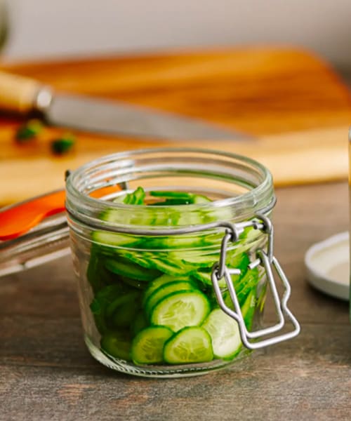
Heading Text Lorem Ipsum Dolor
Subheading text consectetur adipiscing elit
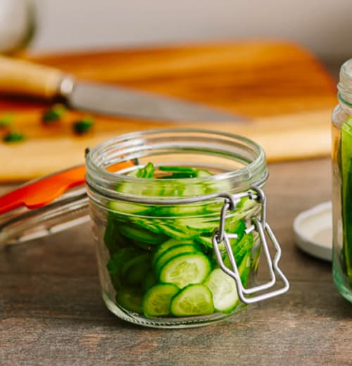
Heading Text Lorem Ipsum Dolor Sit Amet
Hero With Foreground Video
A Hero can also have a Foreground Video component in a Split Layout, similar to a Hero with a Foreground Image.
Foreground Video
This Hero Has A Foreground Video
In this type of Hero, we can have a Foreground Video.
Demo - Cloudinary Video
This is a video that was uploaded to Cloudinary. It is Centered with a Medium size.