Advertisement
Introducing: The World's Most Relaxing Color & How To Use It In Your Bedroom

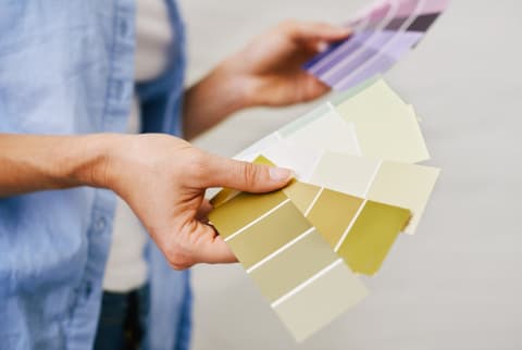
Are you into bright teal or hot pink? Forest green or sky blue?
G.F. Smith, a papermaker in the U.K., recently asked 26,000 participants across 100 countries questions like these and spent months poring over the data. Working in tandem with the University of Sussex, they then compiled a comprehensive report on how people around the world react to certain colors.
"When we are children, everyone has an answer to the question 'What's your favourite colour?'" the authors wrote of the inspiration behind the study. "But something changes as we reach adulthood. Our favourite colour becomes less important as a statement of identity, and many of us never think about [it] again."
The choices they got spanned the rainbow, but greens and blues came out as the most popular colors overall. Interestingly enough, in one of the first color surveys ever recorded at the Chicago World's Fair in 1893, the majority of respondents also liked the color blue the most.
Upon further analysis, researchers identified one explanation for why the hue is such a timeless favorite. When we look at the color blue—especially navy blue—it makes us feel calm and lowers our heart rate, according to their analysis.
What's so relaxing about navy blue?
Now is a good time to mention that everyone has different reactions to colors, so what's soothing to one person might be triggering and unpleasant for another. Speaking for the collective, though, G.F. Smith has a few guesses as to why dark blue can be so calming for so many.
First off, more saturated colors tend to be associated with excitement, so it makes sense that something subdued and easy on the eyes like a navy would fall more on the relaxing side. Plus, the associations we have with certain colors largely shape how we react to them. Dark blue is the color of natural landscapes like the open ocean and a starry sky—both of which can call to mind nighttime and rest. The biology of the brain could also play a role: Some colors are easier to process than others, which can dictate how we receive them.
How can I work some more navy into my life?
The study doesn't go so far as to name the exact shade of dark blue that's most relaxing, so it's up to you to find one that speaks to your tastes. Once you've found your dream color (we're partial to this Shasta Lake tone from BEHR), here are a few ways to add it to your sleep space.
Make an accent wall.
We featured professional declutterer Kyle Quilici's San Francisco studio in our Holistic Home Tour series because it shows how a few thoughtful design touches can make a small space feel much larger. She was on to something when she painted her studio alcove a rich, deep blue. This accent wall makes a statement without being overwhelming.
If your bedroom is also on the smaller side, you'll want to be extra cautious when working with darker colors like this one. A little goes a long way, and too much can make the room feel claustrophobic.
Give your furniture and accessories a fresh paint job.
Breathe some new life into that white dresser or mirror with a fresh coat of navy paint. Painting old pieces adds a quick pop of color, and it's a lot cheaper (and more Earth-friendly) than ordering something brand-new.
Update your gallery wall.
Add subtle hints of calming blue to your wall displays by giving your frames a new paint job, opting for art that incorporates the color, or hanging photography of expansive open ocean scenes or dark, clear skies.
Make sure you can see the color from your bed.
Did you catch mbg's recent article about the most important place at home to design with intention? It's the area across from your bed since it's likely the first one you see when you wake up in the morning and the last you take in before you go to sleep. So be sure to play around with adding some dark blue within your pillow's line of sight—or use a well-placed mirror to get it there.
Watch Next
Enjoy some of our favorite clips from classes
Enjoy some of our favorite clips from classes
What Is Meditation?
Mindfulness/Spirituality | Light Watkins
Box Breathing
Mindfulness/Spirituality | Gwen Dittmar
What Breathwork Can Address
Mindfulness/Spirituality | Gwen Dittmar
The 8 Limbs of Yoga - What is Asana?
Yoga | Caley Alyssa
Two Standing Postures to Open Up Tight Hips
Yoga | Caley Alyssa
How Plants Can Optimize Athletic Performance
Nutrition | Rich Roll
What to Eat Before a Workout
Nutrition | Rich Roll
How Ayurveda Helps Us Navigate Modern Life
Nutrition | Sahara Rose
Messages About Love & Relationships
Love & Relationships | Esther Perel
Love Languages
Love & Relationships | Esther Perel
